-
Interior Designers: Studio O+A
- Area: 106000 ft²
- Year: 2013
-
Photographs:Jasper Sanidad
-
Manufacturers: Mash Studios
-
Contractor: Novo Construction, NOVO Construction

Text description provided by the architects. As tech companies take root in urban locations where space is limited, the collegial spirit of Silicon Valley finds new modes of expression in high-rise buildings and converted industrial facilities. Key to our design for Yelp was the concept of a vertical campus– an all-encompassing, self-contained community stacked on multiple floors. Yelp moved its HQ from a smaller site in San Francisco to a classic Financial District high-rise. As with most multi-story occupancies, the design challenge at Yelp was to facilitate group dynamics so that people interact with each other even though they work on different floors.
In other words– how do you create a neighborhood in a tower?

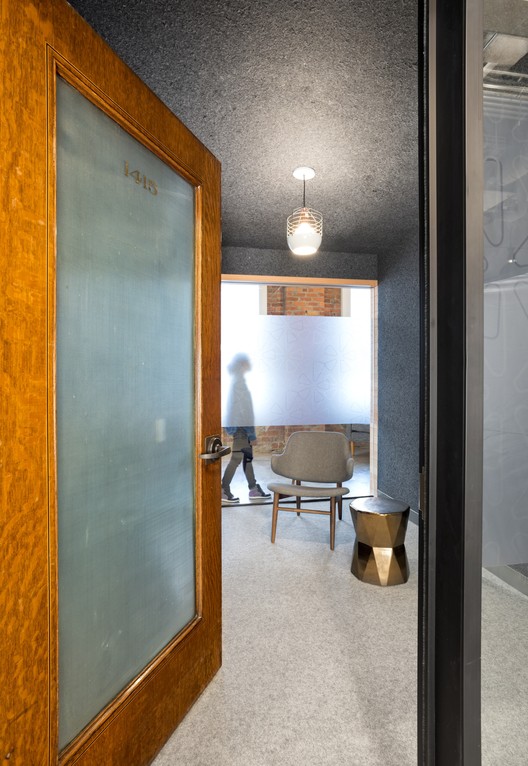
One way is to give each floor a destination that will appeal to all the floors. At Yelp we placed a fully-equipped coffee shop on the 8th floor, a break room with window seating on the 5th, and semi-private pods for chess or chatting on the 11th. Each floor’s common areas thus become common to the company at large and not just to those whose workstations occupy that level.

In a high-rise campus the central gathering place is vertically central. Yelp’s reception area is on the 9th floor, with other departments above and below. To make the reception worthy of a trip up or down in the elevator, O+A created a “General Store,” a modern pop-up improvisation on Yelp’s place in the new world of commercial entrepreneurship. Taking our cues from another era of commerce when candy was sold in jars and signage was gold-leaf painted on a window, we created a lobby with the layout of a retail operation. The layout, but not, in fact, the function—none of the “merchandise” on display is for sale and the vintage cash register at the reception desk is strictly for show. Guests, however, may help themselves to the candy.

Echoing this nod to the past, is the placement throughout Yelp’s entire campus of finely-crafted doors reclaimed from offices that originally occupied the site. Many of these doors include fluted or frosted glass panels and door-knobs from another era. Combined with the exposed brick that is prevalent on every floor of Yelp’s HQ, these touches lend the weight of history to a design that is looking determinedly forward.

Perhaps the smoothest juxtaposition of old and new occurs in the coffee bar. The brick walls and abundant natural light of the seating area give the space a SOMA café texture, while the kitchen includes the most modern artisan hot beverage facilities. Access to the bar storage and service areas is through a blind door that appears to be a smooth, wood wall. Custom lighting in this area is suspended from rope fixtures individually hand-woven. With local coffee companies like Blue Bottle and Sightglass rotating baristas in the bar, the theme of handmade, top-quality production is repeated in every detail of the space. Because of it, Yelp’s employees will always have a free latte at their fingertips—and a unique space to drink it in.


